Background
The San Francisco Bay Area, or officially speaking the “San Jose-San Francisco-Oakland, CA Combined Statistical Area” is the 5th largest metropolitan area in the United States, with a population of 9.7 million people, and 100+ cities. It might not seem too surprising to learn it takes 27 different public transit agencies to cover this wide an area.
That’s a shame, because it SHOULD be surprising. New York City with it’s 20 million people, Washington DC + Baltimore with 10 million, and Chicago with 9.8, have a grand total of 15 transit agencies between them. I wouldn’t be surprised if the SF Bay Area had more public transit organizations per capita than any urban area on the planet.
This is a pretty absurd situation to be in, and results in exactly as much confusion and waste as one would expect. To that end Seamless Bay Area was formed as a 501(c)4 nonprofit to be, in their own words: “a not-for-profit project whose mission is to transform the Bay Area’s fragmented and inconvenient public transit into a world-class, unified, equitable, and widely-used system by building a diverse movement for change and promoting policy reforms”.
To help them in pursuit of this laudable goal, I volunteered my data science skills to help analyze their online messaging, and since Twitter is their primary outlets of social media outreach that seemed like a high impact place to begin.
Overview
The first step was to collect the data, which I did through the Twitter analytics dashboard. Next was to explore the data and see if there were any obvious patterns, and get a basic sense of how the data was distributed. Once all the data was collected, I trained a classification model to put tweets into two buckets based on engagement rate (aka, how many people were liking/replying/retweeting/etc. compared to the number of people seeing that tweet) either high (above average) or low (below average). I took 80% of the data to train the model with (stratifying by class since there were roughly twice as many low engagement tweets as high engagement ones) and tested it on the other 20%.
To follow that up I performed some feature engineering to extract elements that could be used in a linear regression, and to make some more human readable suggestions about what kinds of things Seamless could do with their Tweets to maximize engagement.
All code was written in Python.
Cleaning
Seamless currently has about 4300 followers on Twitter, and has a relatively active account tweeting on average once per day. Using the Twitter analytics dashboard I collected a CSVs for each month starting in July 2022 and going back to their first tweet in June 2018. These CSV’s were turned into pandas dataframes and appended together into a single table. First we need to load all libraries we’ll be using for this project.
import pandas as pd
import numpy as np
import re
import os
import statistics as stat
from sklearn import linear_model
from sklearn.linear_model import LinearRegression
import matplotlib.pyplot as plt
import random; random.seed(53)
from sklearn.feature_extraction.text import TfidfVectorizer
from sklearn.naive_bayes import MultinomialNB
from sklearn.model_selection import train_test_split
from sklearn import metrics
from sklearn.metrics import accuracy_score
from sklearn.feature_extraction.text import CountVectorizer
from sklearn import
Now we’re ready to load the data.
  #get a list of filenames
  labels = os.listdir('{filepath}/tweets')
  #each month of tweets is in a seperate .csv, so we combine them together
  csvs = []
  for x in labels:
    csvs.append(pd.read_csv('{filepath}/tweets' + x ))
  df = pd.concat(csvs)
Howeverm there were a bunch of “promoted” columns that looked like they might be empty. Seamless had an ad budget of $0 and wasn’t promoting anything so this made sense. Just to be sure I looked at every row in those columns to make sure they were in fact empty.
  # Every column from 23 to the end is a "promoted" column, which we suspect has no data
  promoted_cols = df.iloc[:,22:]
  # Loop through the columns, comparing the sum of all comparisons to the columns length
  temp1 = []
  for y in range(len(promoted_cols.columns)):
    temp = []
    for x in range(len(promoted_cols)):
      temp.append(promoted_cols.iloc[x,y] == '-')
    temp1.append(sum(temp) == len(promoted_cols))
   sum(temp1) == len(promoted_cols.columns)
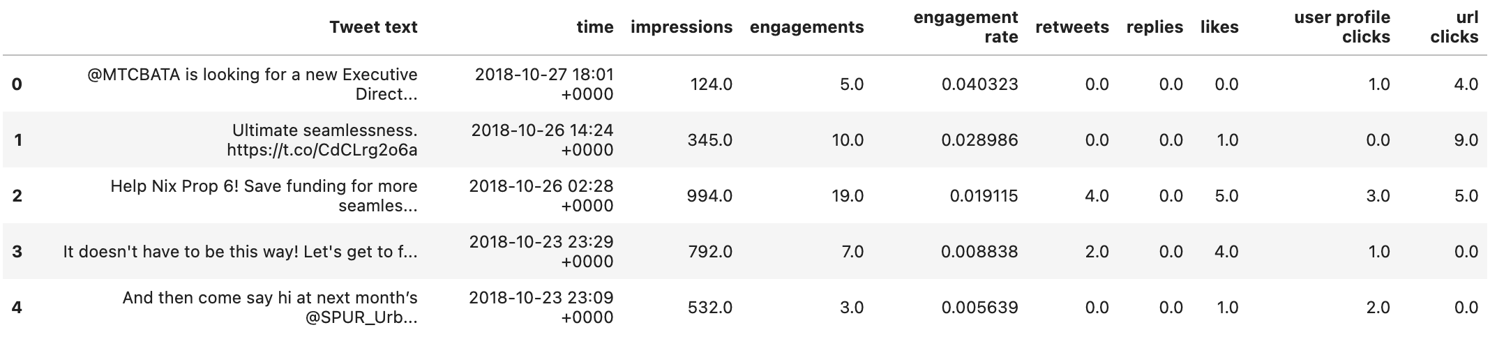
This gave a result of “True” which meant all those columns are empty and we can safetly drop them. We’re also going to drop the first two columns because Tweet ID and Permalink are just identifiers we won’t be using.
df = df.iloc[:,2:12]
This leaves us with a dataframe looking like this:
Exploration
My first step in exploratory data analysis was just to see if there were any obvious linear relationships between the engagement and the only other independent variable provided in the original data - time. I did this by calculating the r-squared, or, what percent of the variation in engagement rate can be explained by time.
We need to take the string that’s been provided and convert it to a datetime object first
from datetime import datetime
temp = []
for x in range(len(df['time'])):
    # It's in a weird format that datetime doesn't accomodate, so we'll need to remove the last
    # 6 characters of the string and replace it with an appropriate seconds identifier
    temp.append(datetime.strptime(str(df['time'].iloc[x][0:-6] + ':00'), '%Y-%m-%d %H:%M:%S'))
df['time'] = temp
It’s reasonable to hypothesize that tweets during active hours would be more popular than ones during off hours like the middle of the night, but let’s see if that’s actually the case.
#check the relationship between hour of the day and engagements
model = LinearRegression()
a = df['hour'].to_numpy()
x = a.reshape(-1, 1)
y = df['engagements']
model.fit(x,y)
r_sq = model.score(x, y)
print(r_aq)
This gave us a result of 0.000866, which is pretty terrible. That means roughly 0.09% of the variation in engagement rate is explained by what hour of a date a tweet was made.
Maybe tweet length will be better.
# AVERAGE NUMBER OF WORDS
y = []
for x in df['tweet words']:
    y.append(len(x))
df['tweet length'] = y
#check the relationship between hour of the day and engagements
model = LinearRegression()
a = df['tweet length'].to_numpy()
x = a.reshape(-1, 1)
y = df['engagements']
model.fit(x,y)
r_sq = model.score(x, y)
print(r_sq)
0.0074, which is technically better, but that’s not saying much. This seems like a good time to take a look at our target variable and see what’s going on.
df['engagements'].hist(bins=20)
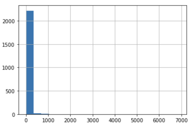
Well that might explain some of it. Engagement is incredibly skewed. It looks like nearly all tweets have less than 100 total engagements. Specifically, the mean of engagements is ~42 while the standard deviation is over 200. The skew is 24.85, which means only 20% of tweets are above average.
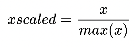
I thought perhaps this was because individual components of engagement didn’t having the same distribution (as a reminder these are retweets, likes, replies, url clicks and profile clicks). I normalized each of the columns via maximum absolute scaling so that each value is between -1 and 1 to make direct comparison more legible. Using the follwing formula:
Calculated with:
stat.stdev(sorted_hi_value_tweets['{variable name}'] / sorted_hi_value_tweets['{variable name}'].abs().max())
- Retweets - 0.076
- Likes - 0.088
- Replies - 0.106
- Profile Clicks - 0.072
- URL Clicks - 0.069
Replies has the largest standard deviation, which isn’t surprising since so many tweets have a tiny number of them.
It’s no wonder finding correlations is hard, most tweets don’t have enough engagement to say anything in particular about them. But it does mean that there are some extreme outliers we can look at that might tell us something about what identifies a very successful tweet. I took a look at that top 20% of both engagement and engagement rate to see if there were any obvious takeaways.
Interestingly - the two were actually very different. The top 30 tweets by engagement all featured either time sensitive calls to action (vote on X immediately, come to Y event tomorrow, etc.) or had links to maps. However the top 30 tweets by engagement were almost entirely congratulations or thanks to other accounts (ex: @twitter_user Thanks for your support! 🙏🚆🚍).
Feature Engineering
Before the data can be used for modeling we’ll have to go through some pre-processing. We need to perform all the feature engineering that I suspect will be necessary for the modeling step. Specifically, I want to identify links/attached media, @replies (when the tweet references another twitter account), calls to action, and sentiment score. Let’s do them in that order, starting with links.
#add a space to the end of every tweet so we can find links at the end of tweets
temp = []
for x in range(len(df)):
    temp.append(df['Tweet text'][x] + ' ')
df['Tweet text'] = temp

#find every sub-string that's "https:// + some characters + a space"
links = []
for x in range(len(df)):
    a = re.findall(r'https://.* ', df['Tweet text'].iloc[x])
    links.append(a)
df['links'] = links

#do a bunch of annoying cleaning so that each item is a nice list of links
temp = []

for x in range(len(df)):
    temp.append(re.split('\s', str(df['links'][x])))

for x in range(len(temp)):
    temp[x] = temp[x][0:-1]

for x in range(len(temp)):
    temp[x] = re.sub('\[', '', str(temp[x]))

for x in range(len(temp)):
    temp[x] = re.sub('\]', '', str(temp[x]))

for x in range(len(temp)):
    temp[x] = re.sub('\'', '', str(temp[x]))

for x in range(len(temp)):
    temp[x] = re.sub('\"', '', str(temp[x]))

df['links'] = temp
This gives us a list which looks like this:
Next is replies (as in, tweets from Seamless that mention another Twitter account). The idea is to build columns of dummy variables that are 0 if that tweet doesn’t contain a mention of a specific account and a 1 if it does. Bear with me, this took a lot of wrangling.
#split the tweets into individual words
replies = []
for x in range(len(df)):
a = re.split(' ', df['Tweet text'].iloc[x])
replies.append(a)
df['replies_sentance'] = replies
#find all the replies, aka sub-strings starting with @
temp3 = []
for z in range(len(df)):
temp = []
for x in df['replies_sentance'][z]:
temp.append(re.findall(r'@.*', x))
temp2 = []
for y in temp:
if len(y) > 0:
temp2.append(y)
temp3.append(temp2)
df['replies'] = temp3
#put it into a list
temp = []
for x in df['replies']:
temp.append(list(x))
#I couldn't get the dummies to work further down so I converted it into a string, and then split
#it again
temp = []
for x in df['replies']:
if len(x) > 0:
a = re.sub('\[', '', str(x))
b = re.sub('\]', '', a)
c = re.sub('\'', '', b)
d = re.sub('\,', '', c)
temp.append(re.split(' ', d))
else:
temp.append('')
#split each of the first 5 replies into a seperate column, so that dummies can be made
rep = []
rep1 = []
rep2 = []
rep3 = []
for x in range(len(temp)):
if len(temp[x]) == 0:
rep.append('')
rep1.append('')
rep2.append('')
rep3.append('')
if len(temp[x]) == 1:
rep.append(temp[x][0])
rep1.append('')
rep2.append('')
rep3.append('')
if len(temp[x]) == 2:
rep.append(temp[x][0])
rep1.append(temp[x][1])
rep2.append('')
rep3.append('')
if len(temp[x]) == 3:
rep.append(temp[x][0])
rep1.append(temp[x][1])
rep2.append(temp[x][2])
rep3.append('')
if len(temp[x]) >= 4:
rep.append(temp[x][0])
rep1.append(temp[x][1])
rep2.append(temp[x][2])
rep3.append(temp[x][3])
#build a dataframe that we'll use for the dummies
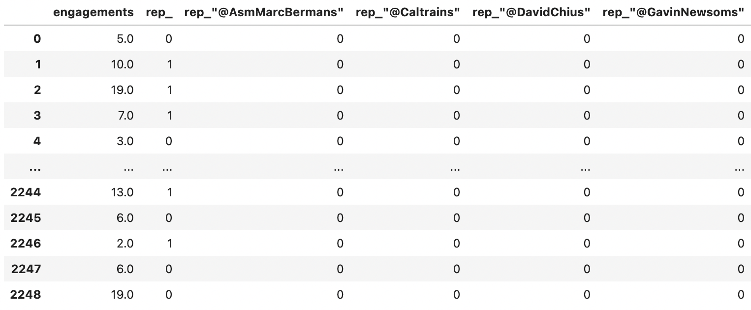
df1 = pd.DataFrame()
df1['engagements'] = df['engagements']
df1['rep'] = rep
df1['rep1'] = rep1
df1['rep2'] = rep2
df1['rep3'] = rep3
df1 = pd.get_dummies(df1)
print(df1)
Here’s what that looks like:
Let’s also sum the number of links, mentions and emojis:
import emoji

#function to check if sth is an emoji
def char_is_emoji(character):
    return emoji.distinct_emoji_list(character)

#function to count emoji
def emoji_counter(text_string):
    count = 0
    for x in text_string:
        a = char_is_emoji(x)
        if len(a) > 0:
            count += 1
    return count

df['emoji_count'] = df['Tweet text'].apply(emoji_counter)
temp = []
for x in df['replies']:
    if len(x) > 0:
        a = re.sub('\[', '', str(x))
        b = re.sub('\]', '', a)
        c = re.sub('\'', '', b)
        d = re.sub('\,', '', c)
        temp.append(re.split(' ', d))
    else:
        temp.append('')
temp2 = []
for x in temp:
    temp2.append(len(x))
df['sum_mentions'] = temp2
#Let's check tweets with links and find it's correlation with engagements
has_links = []
for x in df['links']:
    if type(x) == str:
        has_links.append(1)
    else:
        has_links.append(0)
temp = []
for x in df['links']:
    temp.append(re.split(' ', str(x)))
temp2 = []
for x in temp:
    temp2.append(len(x))
df['link_count'] = temp2
df['word_count'] = [len(re.split(' ', x)) for x in df['Tweet text']]
Moving on to the last feature I want to create: sentiment score. This works by getting a list of positive and negative words, then comparing each tweet and assigning it a score from -1 to 1 based on how many (if any) of those words it has. This list was downloaded from Kaggle and can be found
HERE:
words = pd.read_excel('/Users/grahamsmith/Documents/SpringboardWork/Positive and Negative Word List.xlsx')

# negative words first
temp = []
for x in words['Negative Sense Word List']:
    temp.append(str(x))
words['Negative Sense Words'] = temp
temp = []
for x in df['tweet words']:
    temp.append([ele for ele in list(words['Negative Sense Words']) if(ele in str(x))])
df['Negative words'] = temp

# then positive words
temp = []
for x in words['Positive Sense Word List']:
    temp.append(str(x))
words['Positive Sense Words'] = temp
temp = []
for x in df['tweet words']:
    temp.append([ele for ele in list(words['Positive Sense Words']) if(ele in str(x))])
df['Positive words'] = temp
Sentiment score is calculated by subtracting the number of negative words in the tweet from the number of positive words and dividing it by the total number of words to find a ratio of positive:negative.
temp = []
for x in range(len(df)):
    temp.append((len(df['Positive words'][x])/len(df['Tweet text'][x])) - (len(df['Negative words'][x])/len(df['Tweet text'][x])))
df['Sentiment Score'] = temp
Let’s take the date column and split it into the individual time components (day/hour/minute)
#let's make hour and minute their own columns for the regression
#for some inexplicable reason, to_csv reverts datetime objects to strings so it needs to be converted again
from datetime import datetime
temp = []
for x in range(len(df['time'])):
    temp.append(datetime.strptime(str(df['time'].iloc[x]), '%Y-%m-%d %H:%M:%S'))
df['time'] = temp

temp = []
for x in df['time']:
    temp.append(x.hour)
df['hour'] = temp

temp = []
for x in df['time']:
    temp.append(x.minute)
df['minute'] = temp

temp = []
for x in df['time']:
    temp.append(x.isoweekday())
df['day'] = temp
At this point we’ve identified several potentially important features and extracted them from the tweet text data, including links, sentiment, and replies. We’ve also performed some baseline regressions with time and tweet length, the best of which only had an R^2 of 0.023, which is not especially powerful. We’re ready to get to modeling.
Modeling
The first order of business is to build some models to predict engagement rate from tweet text. The question can be approached as a simple classification problem, where the label is “high engagement” (1) or “low engagement” (0). In this case I’m defining “high engagement” as an engagement rate above the mean. We’ll use a Multinomial Naive Bayes classification model with two different methods of vectorization (the method by which you turn human-legible words into computer-legible numbers).
The first vectorizer is simply a count of the words, aka CountVectorizer, which is used to transform a given text into a vector on the basis of the frequency (count) of each word that occurs in the entire text.
The second method is a slightly more complicated version called TFIDF, or the mouthful Term Frequency Inverse Document Frequency, which works by proportionally increasing the number of times a word appears in the document but is counterbalanced by the number of documents in which it is present. In other words, it finds words which are common in one class but not the other.
A few notes on the hyperparameters: min_df and max_df Ignore terms that have a document frequency higher than 90% (very frequent), and lower than the 5% (highly infrequent), this has a similar effect of the stopwords in that it pulls out useless words.
I attempted an ngram_range of (1,3) - meaning the vectorizers will incorporate bi- and tri-grams alongside single words, but it made almost literally no difference so I removed it. I felt unnessesary hyperparameters remove clarity without adding any additional information, although they do make your model feel cooler.
Let’s create our classes
mean = df['engagement rate'].mean()
df['target'] = np.where((df['engagement rate'] > mean), 1, 0)
We should check the proportion of classes in case we need to stratify our train/test sets
print('the proportion of our classes is: ' + str(len( df[df['engagement rate'] > mean] )/ len(df)))
The proportion of our classes is: 0.346, which we’ll have to keep in mind before we build the models there’s one last preparation step - removing stopwords. These are common words that would completely overwhelm the models but don’t actually tell us much, like pronouns (I, she, he, they, etc.), prepositions (by, with, about, until, etc.), conjunctions (and, but, or, while, etc.) and other common errors like single letters or numbers
We can do this by just defining a list of words for the vectorizer
#define stopwords
stopwords = ['mon','articl','amp',"https","0o", "0s", "3a", "I", "she", "he", "they", "by", "with", {...}]
Now let’s build that model!
#create target
y = df['target']

#create train and test set
X_train, X_test, y_train, y_test = train_test_split(df['Tweet text'], y, random_state=53, test_size=.25, stratify=y)

# initialize count vectorizer with english stopwords eliminating the least and most frequent words
count_vectorizer = CountVectorizer(stop_words=stopwords, min_df=.05, max_df=.9)

# create count train and test variables
count_train = count_vectorizer.fit_transform(X_train, y_train)
count_test = count_vectorizer.transform(X_test)

# initialize tfidf vectorizer
tfidf_vectorizer = TfidfVectorizer(stop_words=stopwords, min_df=.05, max_df=0.9)

# create tfidf train and test variables
tfidf_train = tfidf_vectorizer.fit_transform(X_train, y_train)
tfidf_test = tfidf_vectorizer.transform(X_test)
# create a MulitnomialNB model
tfidf_nb = MultinomialNB()
tfidf_nb.fit(tfidf_train, y_train)

# get predictions
tfidf_nb_pred = tfidf_nb.predict(tfidf_test)

# calculate accuracy
tfidf_nb_score = accuracy_score(y_test, tfidf_nb_pred)

# create a MulitnomialNB model
count_nb = MultinomialNB()
count_nb.fit(count_train, y_train)

# get predictions
count_nb_pred = count_nb.predict(count_test)

# calculate accuracy
count_nb_score = accuracy_score(y_test, count_nb_pred)

print('NaiveBayes Tfidf Score: ', tfidf_nb_score)
print('NaiveBayes Count Score: ', count_nb_score)
NaiveBayes Tfidf Score: 0.6536412078152753
NaiveBayes Count Score: 0.650088809946714
Tfidf is the winner with 0.66% accuracy, although Count was very close. However this isn’t super useful to us on its own, let’s see this broken down by class and vectorization method.
# let's see count first
print(classification_report(y_test, count_nb_pred))
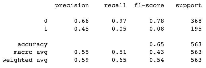
This tells us that the model was about 33% more precise (the % of predictions that were accurate) with low engagement tweets than with high engagement ones.
The model’s recall (the % of all correct answers that were accurately found) was also better for low engagement tweets, but by a considerably higher margin - nearly two orders of magnitude.
This means that while the model was decent at guessing whether or not a tweet would be low engagement, it’s actually much worse at catching high engagement ones than the overall weighted average would imply; It misclassified 92% of high engagement tweets.
# let's do TFIDF next
print(classification_report(y_test, tfidf_nb_pred))
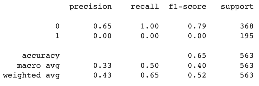
Strangely enough, TFIDF is actually completely missing all the high engagement tweets so its accuracy is actually very deceptive. This indicates we should be just using regular counts instead.
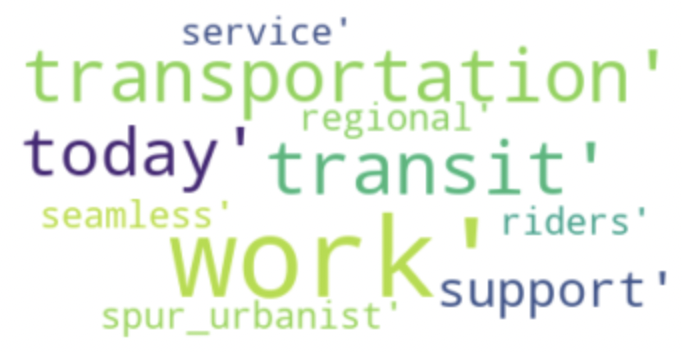
We’ll also want to look at which words occured most frequently with one class over the other.
#get top 10 keywords
feature_names = np.array(tfidf_vectorizer.get_feature_names_out())
tfidf_sorting = np.argsort(feature_names.flatten())[::-1]

top_10 = feature_names[tfidf_sorting][:10]
bottom_10 = feature_names[tfidf_sorting][-10:]

print(f'''Top 10 keywords most likely to elicit a higher engagement rate are:
{top_10}, and the top 10 keywords most likely to elicit a lower engagement were: {bottom_10}''')
Top 10 keywords most likely to elicit a higher engagement rate are:
[‘work’ ‘transportation’ ‘transit’ ‘today’ ‘support’ ‘spur_urbanist’
‘service’ ‘seamless’ ‘riders’ ‘regional’]
Top 10 keywords most likely to elicit a lower engagement were: [‘integration’ ‘integrated’ ‘funding’ ‘fares’ ‘fare’ ‘caltrain’ ‘board’
‘bay’ ‘area’ ‘agencies’]
This might be easier to visualize as a wordcloud
#Top 10 keywords most likely to elicit a higher engagement rate are
from wordcloud import WordCloud
word_cloud = WordCloud(collocations = False, background_color = 'white').generate(str(feature_names[tfidf_sorting][:10]))
plt.imshow(word_cloud, interpolation='bilinear')
plt.axis("off")
plt.show()
#Top 10 keywords most likely to elicit a lower engagement rate are
from wordcloud import WordCloud
word_cloud = WordCloud(collocations = False, background_color = 'white').generate(str(feature_names[tfidf_sorting][-10:]))
plt.imshow(word_cloud, interpolation='bilinear')
plt.axis("off")
plt.show()
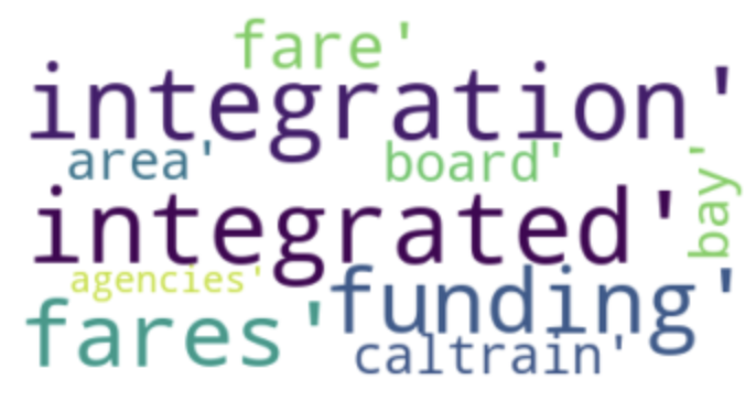
This is a little hard to interpret, but it seems like tweets that indicate an immediate call to action (‘today’, ‘support’) do well, and people apparently don’t like to hear about caltrain! I’m not sure what to take away from the fact that so many phrases related to the bay area do poorly.
Words alone might make a tweet, but they are just one thing that impacts audience’s engagement with it. We can try to predict engagement rate using a set of other tweets’ features. Specifically: day of the week, hour of the day, minute, number of mentions the tweet includes, and sentiment score. It’s also possible that classification was the wrong approach and we should be trying to predict engagement rate linearly. To that end, let’s plug these features into a linear regression.
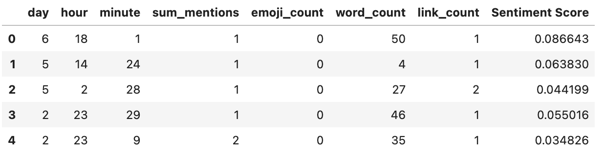
#create a df for linear regression,
df_pred_lr = df[['engagement rate','day','hour', 'minute', 'sum_mentions',
                  'emoji_count', 'word_count','link_count', 'Sentiment Score']]
#create features
x_lr = df_pred_lr.iloc[:,1:]

#create target
y_lr = df_pred_lr['engagement rate']

x_lr.head()
Just for reference, here’s what our data looks like.
Now to do the regression itself.
from sklearn.linear_model import LinearRegression
from sklearn.metrics import mean_squared_error

#create new train & test set
X_train, X_test, y_train, y_test = train_test_split(x_lr, y_lr, random_state=53, test_size=.33)

#initialise model
lr = LinearRegression()

#fit & predict
lr.fit(X_train, y_train)
lr_pred = lr.predict(X_test)

#evaluate
print('Mean Squared Error (MSE):', metrics.mean_squared_error(y_test, lr_pred))
print('Root Mean Standard Deviation (RMSE):', np.sqrt(metrics.mean_squared_error(y_test, lr_pred)))
print('Observation Standard Deviation:', np.std(df['engagement rate']))
Mean Squared Error (MSE): 0.0007673429816235223
Root Mean Standard Deviation (RMSE): 0.02770095633048654
Observation Standard Deviation: 0.026600178403302095
A RMSE that’s greater than half the standard deviation of the observed data is considered high, so this is a very good score (almost suspiciously so, it makes me think I might have messed something up) - source
However RMSE is a bit hard to interpret because you need to keep in mind the size of the units. We can use Mean Absolute Percentage Error (MAPE) instead, which is the average of the absolute value of the predicted values subtracted by the real values.
#calculate the MAPE
MAPE = []
for x in y_test:
    for y in lr_pred:
        MAPE.append(x - y)
print('Mean Absolute Percentage Error is: ' + (str(np.round(np.mean(np.abs(MAPE)), decimals=3))))
Mean Absolute Percentage Error is: 0.018
Still pretty good! this means that on average, prediction are 1.8% off, which is pretty fantastic.
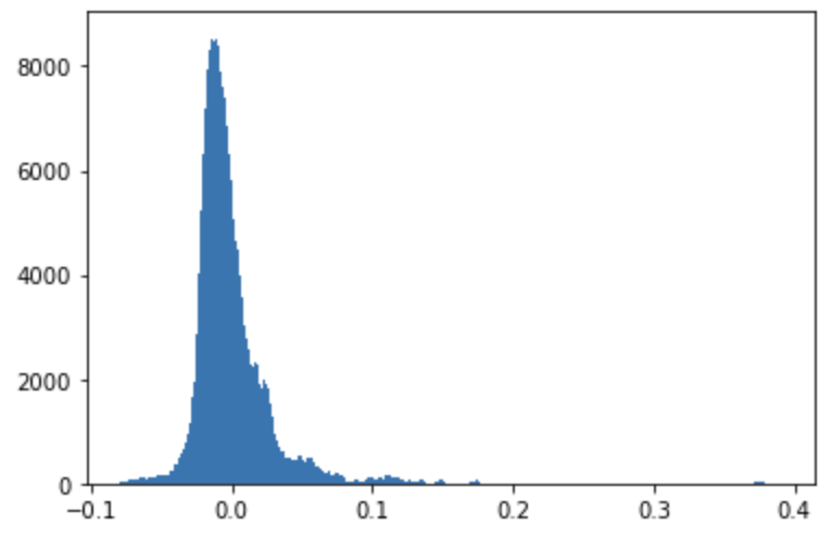
We can also visualize this by building a histogram of the residuals:
#calculate residuals and build a histogram
resids = []
for x in y_test:
    for y in lr_pred:
        resids.append(x - y)
resids = np.array(resids)
plt.hist(resids, bins='auto')
plt.show()
It’s good to know the model works, but this is still not very helpful from a business standpoint. If we want to make actual recommendtion to our stakeholders we need to get the coefficients and see how significant they are.
# I had to remake the regression and because results.summary only worked with a .ols object
import statsmodels.formula.api as smf
regdf = x_lr
regdf = regdf.rename(columns={'Sentiment Score': 'sentiment_score'})
regdf['y'] = y_lr
results = smf.ols('y ~ day + hour + minute + sum_mentions + emoji_count + word_count + link_count + sentiment_score', data=regdf).fit()
print(results.summary())
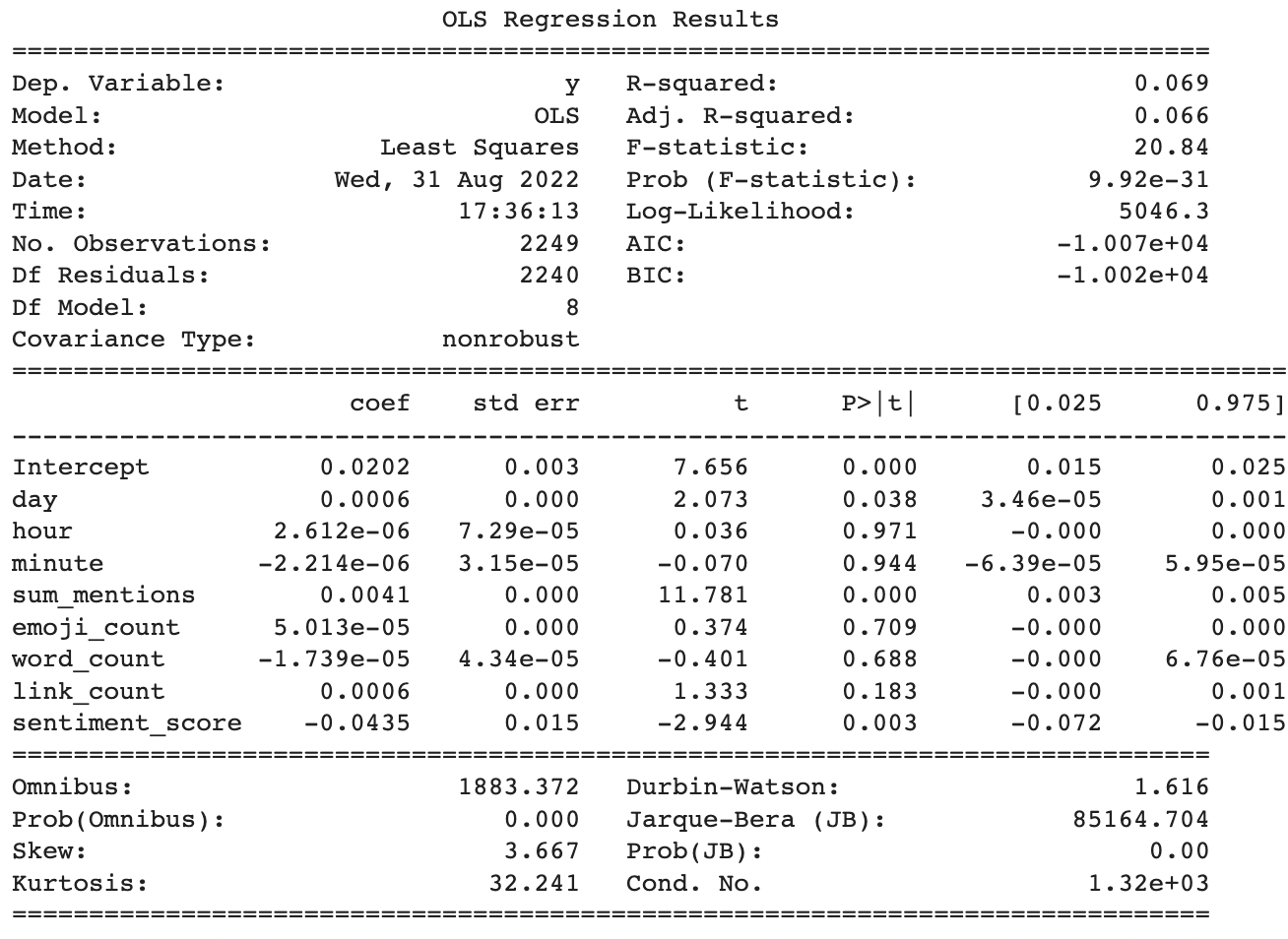
Despite the tight residuals and great MAPE score, only a few of the parameters were statistically significant and they all had small impact sizes.
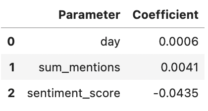
Tweeting later in the day has a slight effect on engagement rate, increasing it by 0.06%. Total number of mentions is a bit better, increasing engagemnet by 0.41%. Sentiment has the largest impact at 4.3%, although interestingly it’s a negative impact meaning that having more negative words (or fewer positive ones) actually increases engagement rate.
Are these small sizes still important? Well, that’s going to depend on the mean and distribution of our target variable. Let’s look at that.
plt.hist(regdf['y'], bins='auto')
plt.show()
print(f'The average engagement score is: ' + str(round(np.mean(regdf['y']), 5)))
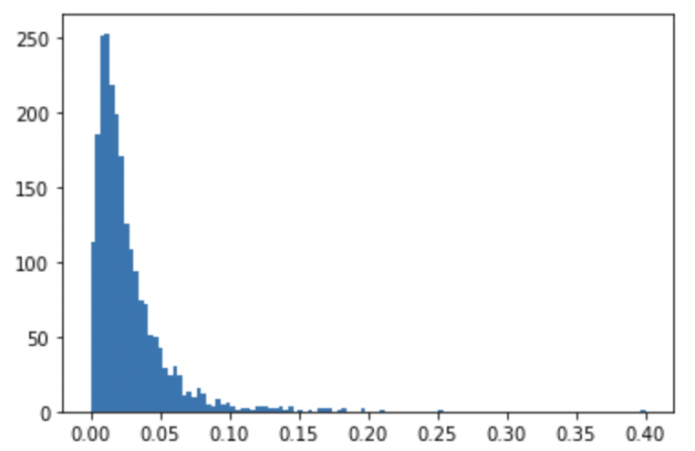
The average engagement score is: 0.0265
Given that mean engagement rate is only 2.6%, the small coefficients are much more impactful than they appear. Sentiment has a huge impact, a single extra negative word (or a single fewer postitve ones) changing engagement rate at nearly double the magnitude of the average engagement rate.
Let’s apply this in an example to see what the best day to tweet is, holding all other variabeles at their mean values to show how this model could be used to make specific recommendations.
#%%capture [--no-stderr]
#check same values but diff day of the week
l = {}
for item in range(0,7):
    prediction = lr.predict([[item,np.mean(x_lr['hour']),np.mean(x_lr['minute']),np.mean(x_lr['sum_mentions']),np.mean(x_lr['emoji_count']),np.mean(x_lr['word_count']),np.mean(x_lr['link_count']),np.mean(x_lr['Sentiment Score'])]])
    l[item] = prediction
    print(f'day ' + str(item + 1) + ' has a predicted engagement rate of ' + str(prediction))
day 1 has a predicted engagement rate of [0.02350074]
day 2 has a predicted engagement rate of [0.0243688]
day 3 has a predicted engagement rate of [0.02523687]
day 4 has a predicted engagement rate of [0.02610494]
day 5 has a predicted engagement rate of [0.02697301]
day 6 has a predicted engagement rate of [0.02784107]
day 7 has a predicted engagement rate of [0.02870914]
It looks like tweeting on a Sunday (day 7) has the highest engagement rate.
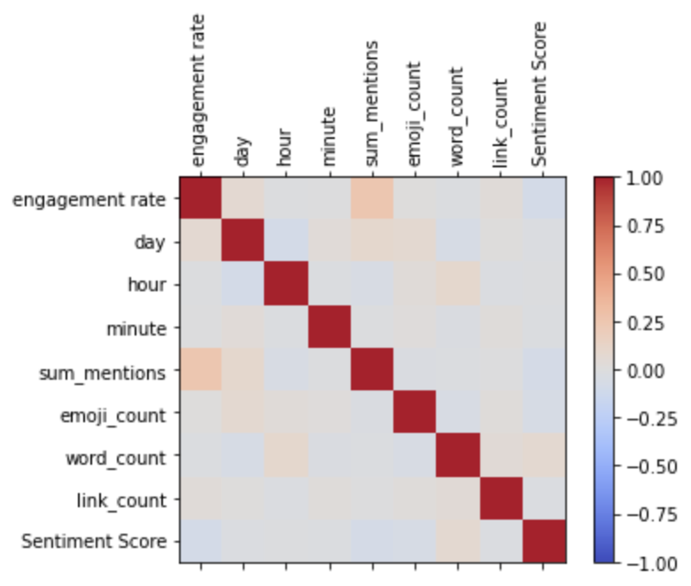
We can also visualize the pairwise correlations of the variables just for fun, as a heatmap:
data = df[['engagement rate','day','hour', 'minute', 'sum_mentions',
                  'emoji_count', 'word_count','link_count', 'Sentiment Score']]
corr = data.corr()
fig = plt.figure()
ax = fig.add_subplot(111)
cax = ax.matshow(corr,cmap='coolwarm', vmin=-1, vmax=1)
fig.colorbar(cax)
ticks = np.arange(0,len(data.columns),1)
ax.set_xticks(ticks)
plt.xticks(rotation=90)
ax.set_yticks(ticks)
ax.set_xticklabels(data.columns)
ax.set_yticklabels(data.columns)
plt.show()
Or as a pairplot:
from seaborn import pairplot
pairplot(data)
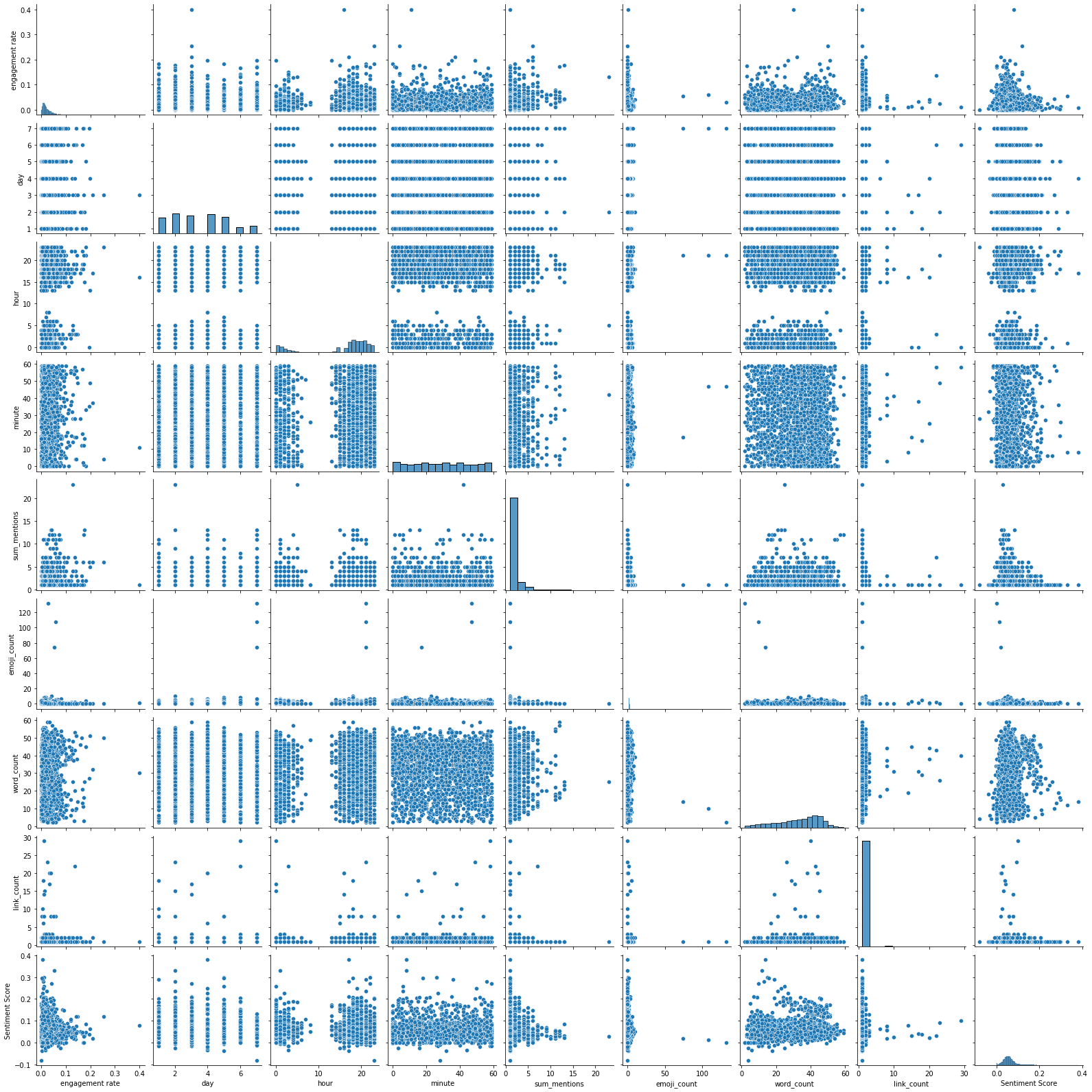
It’s a little hard to see, but this corresponds to what the model was telling us - sum_mentions is the only factor that clearly has a correlation with engagement rate.
Conclusion
So what can we say about all of this? The results weren’t as clear as I would like, but from a practical standpoint we can make a few recommendations. First of all, the more interactive a tweet is, the better. This includes mentioning other accounts, attaching pictures and maps, and having immediate calls to action. People don’t especially like hearing about fares, and there’s a slight bias favoring negative words which I would attribute to everyone loving to complain about bad public transit. The data doesn’t seem to indicate a strong correlation with any particular time/day, but it’s possibly there may be a very slight positive effect when tweeting on the weekend.
There are some major caveats to these conclusions though. First of all, the data is clearly still pretty dirty and really needs a few more rounds of filtering before I could talk about any of these results with great confidence. Additionally, problems like this really should be solved with neural networks (espcially Convolutional Neural Networks or Recurrant Neural Networks). Natural language processing is a complicated field, and deserves more finely tuned models than the relatively simple ones I’ve used here.
Acknowledgements
I’d like to thank Seamless Bay Area for giving me access to their data, this has been a fascinating project. AJ Sanchez, my Springboard mentor has also been tremendous with all of his advice. Finally a big shout out to David Giles (@github.com/dabbodev) for his infinite knowledge of markdown, python, and the universe.